LINK:
http://www.billbuxton.com/multitouchOverview.html
Bill Buxton
Microsoft Research
Original: Jan. 12, 2007
Version: Feb 12, 2009
Keywords / Search Terms
Multi-touch, multitouch, input, interaction, touch screen, touch tablet, multi-finger input, multi-hand input, bi-manual input, two-handed input, multi-person input, interactive surfaces, soft machine, hand gesture, gesture recognition .
Preamble
Since the announcement of the iPhone, an especially large number of people have asked me about multi-touch. The reason is largely because they know that I have been involved in the topic for a number of years. The problem is, I can't take the time to give a detailed reply to each question. So I have done the next best thing (I hope). That is, start compiling my would-be answer in this document. The assumption is that ultimately it is less work to give one reasonable answer than many unsatisfactory ones.
Multi-touch technologies have a long history. To put it in perspective, the original work undertaken by my team was done in 1984, the same year that the first Macintosh computer was released, and we were not the first. Furthermore, during the development of the iPhone, Apple was very much aware of the history of multi-touch, dating at least back to 1982, and the use of the pinch gesture, dating back to 1983. This is clearly demonstrated by the bibliography of the PhD thesis of Wayne Westerman, co-founder of FingerWorks, a company that Apple acquired early in 2005, and now an Apple employee:
In making this statement about their awareness of past work, I am not criticizing Westerman, the iPhone, or Apple. It is simply good practice and good scholarship to know the literature and do one's homework when embarking on a new product. What I am pointing out, however, is that "new" technologies - like multi-touch - do not grow out of a vacuum. While marketing tends to like the "great invention" story, real innovation rarely works that way.
So, to shed some light on the back story of this particular technology, I offer this brief and incomplete summary of some of the landmark examples that I have been involved with, known about and/or encountered over the years. As I said, it is incomplete and a work in progress (so if you come back a second time, chances are there will be more and better information). I apologize to those that I have missed. I have erred on the side of timeliness vs thoroughness. Other work can be found in the references to the papers that I do include.
Please do not be shy in terms of sending me photos, updates, etc. I will do my best to integrate them.
For more background on input, see also the incomplete draft manuscript for my book on input tools, theories and techniques:
http://www.billbuxton.com/inputManuscript.html
For more background on input devices, including touch screens and tablets, see my directory at:
http://www.billbuxton.com/InputSources.html
I hope this helps.
Some Dogma
There is a lot of confusion around touch technologies, and despite a 25 year history, very little information or experience with multi-touch interaction. I have three comments to set up what is to follow:
1. Remember that it took 30 years between when the mouse was invented by Engelbart and English in 1965 to when it became ubiquitous, on the release of Windows 95. Yes, it was released commercially on the Xerox Star and PERQ workstations in 1982, and I used my first one in 1972 at the National Research Council of Canada. But statistically, that doesn’t matter. It took 30 years to hit the tipping point. So, by that measure, multi-touch technologies have 5 years to go before they fall behind.
2. Keep in mind one of my primary axioms: Everything is best for something and worst for something else. The trick is knowing what is what, for what, when, for whom, where, and most importantly, why. Those who try the replace the mouse play a fool’s game. The mouse is great for many things. Just not everything. The challenge with new input is to find devices that work together, simultaneously with the mouse (such as in the other hand), or things that are strong where the mouse is weak, thereby complimenting it.
3. To significantly improve a product by a given amount, it probably takes about two more orders of magnitude of cost, time and effort to improve the display as to get the same amount of improvement on input. Why? Because we are ocular centric, and displays are therefore much more mature. Input is still primitive, and wide open for improvement. So it is a good thing that you are looking at this stuff. What took you so long?
Some Framing
I don’t have time to write a treatise, tutorial or history. What I can do is warn you about a few traps that seem to cloud a lot of thinking and discussion around this stuff. The approach that I will take is to draw some distinctions that I see as meaningful and relevant. These are largely in the form of contrasts:
-
Touch-tablets vs Touch screens: In some ways these are two extremes of a continuum. If, for example, you have paper graphics on your tablet, is that a display (albeit more-or-less static) or not? What if the “display” on the touch tablet is a tactile display rather than visual? There are similarities, but there are real differences between touch-sensitive display surfaces, vs touch pads or tablets. It is a difference of directness. If you touch exactly where the thing you are interacting with is, let’s call it a touch screen or touch display. If your hand is touching a surface that is not overlaid on the screen, let's call it a touch tablet or touch pad.
-
Discrete vs Continuous: The nature of interaction with multi-touch input is highly dependent on the nature of discrete vs continuous actions supported. Many conventional touch-screen interfaces are based discrete items such as pushing so-called "light buttons", for example. An example of a multi-touch interface using such discrete actions would be using a soft graphical QWERTY keyboard, where one finger holds the shift key and another pushes the key for the upper-case character that one wants to enter. An example of two fingers doing a coordinated continuous action would be where they are stretching the diagonally opposed corners of a rectangle, for example. Between the two is a continuous/discrete situation, such as where one emulates a mouse, for example, using one finger for indicating continuous position, and other fingers, when in contact, indicate mouse button pushes, for example.
-
Degrees of Freedom: The richness of interaction is highly related to the richness/numbers of degrees of freedom (DOF), and in particular, continuous degrees of freedom, supported by the technology. The conventional GUI is largely based on moving around a single 2D cursor, using a mouse, for example. This results in 2DOF. If I am sensing the location of two fingers, I have 4DOF, and so on. When used appropriately, these technologies offer the potential to begin to capture the type of richness of input that we encounter in the everyday world, and do so in a manner that exploits the everyday skills that we have acquired living in it. This point is tightly related to the previous one.
-
Size matters: Size largely determines what muscle groups are used, how many fingers/hands can be active on the surface, and what types of gestures are suited for the device.
-
Orientation Matters - Horizontal vs Vertical: Large touch surfaces have traditionally had problems because they could only sense one point of contact. So, if you rest your hand on the surface, as well as the finger that you want to point with, you confuse the poor thing. This tends not to occur with vertically mounted surfaces. Hence large electronic whiteboards frequently use single touch sensing technologies without a problem.
-
There is more to touch-sensing than contact and position: Historically, most touch sensitive devices only report that the surface has been touched, and where. This is true for both single and multi touch devices. However, there are other aspects of touch that have been exploited in some systems, and have the potential to enrich the user experience:
-
Degree of touch / pressure sensitivity: A touch surfaces that that can independently and continuously sense the degree of contact for each toouch point has a far higher potential for rich interaction. Note that I use “degree of contact” rather than pressure since frequently/usually, what passes for pressure is actually a side effect – as you push harder, your finger tip spreads wider over the point of contact, and what is actually sensed is amount/area of contact, not pressure, per se. Either is richer than just binary touch/no touch, but there are even subtle differences in the affordances of pressure vs degree.
-
Angle of approach: A few systems have demonstrated the ability to sense the angle that the finger relative to the screen surface. See, for example, McAvinney's Sensor Frame, below. In effect, this lgives the finger the capability to function more-or-less as a virtual joystick at the point of contact, for example. It also lets the finger specify a vector that can be projected into the virtual 3D space behind the screen from the point of contact - something that could be relevant in games or 3D applications.
-
Force vectors: Unlike a mouse, once in contact with the screen, the user can exploit the friction between the finger and the screen in order to apply various force vectors. For example, without moving the finger, one can apply a force along any vector parallel to the screen surface, including a rotational one. These techniques were described as early as 1978 [Herot, C. & Weinzapfel, G. (1978). One-Point Touch Input of Vector Information from Computer Displays, Computer Graphics, 12(3), 210-216.] and again five years later [Minsky, M. (1984). Manipulating Simulated Objects with Real-World Gestures Using a Force and Position Sensitive Screen, Computer Graphics, 18(3), 195-203.].
Such historical examples are important reminders that it is human capability, not technology, that should be front and centre in our considerations. While making such capabilities accessible at reasonable costs may be a challenge, it is worth remembering further that the same thing was also said about multi-touch. Furthermore, note that multi-touch dates from about the same time as these other touch innovations.
-
Size matters II: The ability of to sense the size of the area being touched can be as important as the size of the touch surface. See the Synaptics example, below, where the device can sense the difference between the touch of a finger (small) vs that of the cheek (large area), so that, for example, you can answer the phone by holding it to the cheek.
-
Single-finger vs multi-finger: Although multi-touch has been known since at least 1982, the vast majority of touch surfaces deployed are single touch. If you can only manipulate one point, regardless of with a mouse, touch screen, joystick, trackball, etc., you are restricted to the gestural vocabulary of a fruit fly. We were given multiple limbs for a reason. It is nice to be able to take advantage of them.
-
Multi-point vs multi-touch: It is really important in thinking about the kinds of gestures and interactive techniques used if it is peculiar to the technology or not. Many, if not most, of the so-called “multi-touch” techniques that I have seen, are actually “multi-point”. Think of it this way: you don’t think of yourself of using a different technique in operating your laptop just because you are using the track pad on your laptop (a single-touch device) instead of your mouse. Double clicking, dragging, or working pull-down menus, for example, are the same interaction technique, independent of whether a touch pad, trackball, mouse, joystick or touch screen are used.
-
Multi-hand vs multi-finger: For much of this space, the control can not only come from different fingers or different devices, but different hands working on the same or different devices. A lot of this depends on the scale of the input device. Here is my analogy to explain this, again referring back to the traditional GUI. I can point at an icon with my mouse, click down, drag it, then release the button to drop it. Or, I can point with my mouse, and use a foot pedal to do the clicking. It is the same dragging technique, even though it is split over two limbs and two devices. So a lot of the history here comes from a tradition that goes far beyond just multi-touch.
-
Multi-person vs multi-touch: If two points are being sensed, for example, it makes a huge difference if they are two fingers of the same hand from one user vs one finger from the right hand of each of two different users. With most multi-touch techniques, you do not want two cursors, for example (despite that being one of the first thing people seem to do). But with two people working on the same surface, this may be exactly what you do want. And, insofar as multi-touch technologies are concerned, it may be valuable to be able to sense which person that touch comes from, such as can be done by the Diamond Touch system from MERL (see below).
-
Points vs Gesture: Much of the early relevant work, such as Krueger (see below) has to do with sensing the pose (and its dynamics) of the hand, for example, as well as position. That means it goes way beyond the task of sensing multiple points.
-
Stylus and/or finger: Some people speak as if one must make a choice between stylus vs finger. It certainly is the case that many stylus systems will not work with a finger, but many touch sensors work with a stylus or finger. It need not be an either or question (although that might be the correct decision – it depends on the context and design). But any user of the Palm Pilot knows that there is the potential to use either. Each has its own strengths and weaknesses. Just keep this in mind: if the finger was the ultimate device, why didn’t Picasso and Rembrandt restrict themselves to finger painting? On the other hand, if you want to sense the temperature of water, your finger is a better tool than your pencil.
-
Hands and fingers vs Objects: The stylus is just one object that might be used in multi-point interaction. Some multi-point / multi-touch systems can not only sense various different objects on them, but what object it is, where it is, and what its orientation is. See Andy Wilson’s work, below, for example. And, the objects, stylus or otherwise, may or may not be used in conjunction and simultaneously with fingers.
-
Different vs The Same: When is something the same, different or obvious? In one way, the answer depends on if you are a user, programmer, scientist or lawyer. From the perspective of the user interface literature, I can make three points that would be known and assumed by anyone skilled in the art:
-
Device-Independent Graphics: This states that the same technique implemented with an alternative input device is still the same technique. For example, you can work your GUI with a stylus, touch screen, mouse, joystick, touchpad, or trackball, and one would still consider techniques such as double-clicking, dragging, dialogue boxes as being “the same” technique;
-
The Interchange of devices is not neutral from the perspective of the user: While the skill of using a GUI with a mouse transfers to using a touchpad, and the user will consider the interface as using the same techniques, nevertheless, the various devices have their own idiomatic strengths and weaknesses. So, while the user will consider the techniques the “same”, their performance (speed, accuracy, comfort, preference, etc.) will be different from device to device. Hence, the interactive experience is not the same from device to device, despite using the same techniques. Consequently, it is the norm for users and researchers alike to swap one device for another to control a particular technique.
Some Attributes
As I stated above, my general rule is that everything is best for something and worst for something else. The more diverse the population is, the places and contexts where they interact, and the nature of the information that they are passing back in forth in those interactions, the more there is room for technologies tailored to the idiosyncrasies of those tasks.
The potential problem with this, is that it can lead to us having to carry around a collection of devices, each with a distinct purpose, and consequently, a distinct style of interaction. This has the potential of getting out of hand and our becoming overwhelmed by a proliferation of gadgets – gadgets that are on their own are simple and effective, but collectively do little to reduce the complexity of functioning in the world. Yet, traditionally our better tools have followed this approach. Just think of the different knives in your kitchen, or screwdrivers in your workshop. Yes there are a great number of them, but they are the “right ones”, leading to an interesting variation on an old theme, namely, “more is less”, i.e., more (of the right) technology results is less (not more) complexity. But there are no guarantees here.
What touch screen based “soft machines” offer is the opposite alternative, “less is more”. Less, but more generally applicable technology results in less overall complexity. Hence, there is the prospect of the multi-touch soft machine becoming a kind of chameleon that provides a single device that can transform itself into whatever interface that is appropriate for the specific task at hand. The risk here is a kind of "jack of all trades, master of nothing" compromise.
One path offered by touch-screen driven appliances is this: instead of making a device with different buttons and dials mounted on it, soft machines just draw a picture of the devices, and let you interact with them. So, ideally, you get far more flexibility out of a single device. Sometimes, this can be really good. It can be especially good if, like physical devices, you can touch or operate more than one button, or virtual device at a time. For an example of where using more than one button or device at a time is important in the physical world, just think of having to type without being able to push the SHIFT key at the same time as the character that you want to appear in upper case. There are a number of cases where this can be of use in touch interfaces.
Likewise, multi-touch greatly expands the types of gestures that we can use in interaction. We can go beyond simple pointing, button pushing and dragging that has dominated our interaction with computers in the past. The best way that I can relate this to the everyday world is to have you imagine eating Chinese food with only one chopstick, trying to pinch someone with only one fingertip, or giving someone a hug with – again – the tip of one finger or a mouse. In terms of pointing devices like mice and joysticks are concerned, we do everything by manipulating just one point around the screen – something that gives us the gestural vocabulary of a fruit fly. One suspects that we can not only do better, but as users, deserve better. Multi-touch is one approach to accomplishing this – but by no means the only one, or even the best. (How can it be, when I keep saying, everything is best for something, but worst for something else).
There is no Free Lunch.
-
Feelings: The adaptability of touch screens in general, and multi-touch screens especially comes at a price. Besides the potential accumulation of complexity in a single device, the main source of the downside stems from the fact that you are interacting with a picture of the ideal device, rather than the ideal device itself. While this may still enable certain skills from the specialized physical device transfer to operating the virtual one, it is simply not the same. Anyone who has typed on a graphical QWERTY keyboard knows this.
User interfaces are about look and feel. The following is a graphic illustration of how this generally should be written when discussing most touch-screen based systems:
Look and Feel
Kind of ironic, given that they are "touch" screens. So let's look at some of the consequences in our next points.
-
If you are blind you are simply out of luck. p.s., we are all blind at times - such as when lights are out, or our eyes are occupied elsewhere – such as on the road). On their own, soft touch screen interfaces are nearly all “eyes on”. You cannot “touch type”, so to speak, while your eyes are occupied elsewhere (one exception is so-called “heads-up” touch entry using single stroke gestures such as Graffiti that are location independent). With an all touch-screen interface you generally cannot start, stop, or pause your MP3 player, for example, by reaching into your pocket/purse/briefcase. Likewise, unless you augment the touch screen with speech recognition for all functions, you risk a serious accident trying to operate it while driving. On the other hand, MP3 players and mobile phones mechanical keys can to a certain degree be operated eyes free – the extreme case being some 12-17 year old kids who can text without looking!
· Handhelds that rely on touch screens for input virtually all require two hands to operate: one to hold the device and the other to operate it. Thus, operating them generally requires both eyes and both hands.
· Your finger is not transparent: The smaller the touch screen the more the finger(s) obscure what is being pointed at. Fingers do not shrink in the same way that chips and displays do. That is one reason a stylus is sometimes of value: it is a proxy for the finger that is very skinny, and therefore does not obscure the screen.
· There is a reason we don’t rely on finger painting: Even on large surfaces, writing or drawing with the finger is generally not as effective as it is with a brush or stylus. On small format devices it is virtually useless to try and take notes or make drawings using a finger rather than a stylus. If one supports good digital ink and an appropriate stylus and design, one can take notes about as fluently as one can with paper. Note taking/scribble functions are notably absent from virtually all finger-only touch devices.
· Sunshine: We have all suffered trying to read the colour LCD display on our MP3 player, mobile phone and digital camera when we are outside in the sun. At least with these devices, there are mechanical controls for some functions. For example, even if you can’t see what is on the screen, you can still point the camera in the appropriate direction and push the shutter button. With interfaces that rely exclusively on touch screens, this is not the case. Unless the device has an outstanding reflective display, the device risks being unusable in bright sunlight.
Does this property make touch-devices a bad thing? No, not at all. It just means that they are distinct devices with their own set of strengths and weaknesses. The ability to completely reconfigure the interface on the fly (so-called “soft interfaces”) has been long known, respected and exploited. But there is no free lunch and no general panacea. As I have said, everything is best for something and worst for something else. Understanding and weighing the relative implications on use of such properties is necessary in order to make an informed decision. The problem is that most people, especially consumers (but including too many designers) do not have enough experience to understand many of these issues. This is an area where we could all use some additional work. Hopefully some of what I have written here will help.
An Incomplete Roughly Annotated Chronology of Multi-Touch and Related Work
|
In the beginning ....: Typing & N-Key Rollover (IBM and others).
-
While it may seem a long way from multi-touch screens, the story of multi-touch starts with keyboards.
-
Yes they are mechanical devices, "hard" rather than "soft" machines. But they do involve multi-touch of a sort.
-
First, most obviously, we see sequences, such as the SHIFT, Control, Fn or ALT keys in combination with others. These are cases where we want multi-touch.
-
Second, there are the cases of unintentional, but inevitable, multiple simultaneous key presses which we want to make proper sense of, the so-called question of n-key rollover (where you push the next key before releasing the previous one).
|

Photo Credit
|
|
Electroacoustic Music: The Early Days of Electronic Touch Sensors (Hugh LeCaine , Don Buchla & Bob Moog). http://www.hughlecaine.com/en/instruments.html
-
The history of touch-sensitive control devices pre-dates the age of the PC
-
A number of early synthesizer and electronic music instrument makers used touch-sensitive capacitance-sensors to control the sound and music being made.
-
These were touch pads, rather than touch screens
-
The tradition of innovating on touch controls for musical purposes continued/continues, and was the original basis for the University of Toronto multitouch surface, as well as the CMU Sensor Frame.
|

|
|
1972: PLATO IV Touch Screen Terminal (Computer-based Education Research Laboratory, University of Illinois, Urbana-Champain) http://en.wikipedia.org/wiki/Plato_computer
-
Touch screens started to be developed in the second half of the 1960s.
-
Early work was done at the IBM, the University of Illinois, and Ottawa Canada.
-
By 1971 a number of different techniques had been disclosed
-
All were single-touch and none were pressure-sensitive
-
One of the first to be generally known was the terminal for the PLATO IV computer assisted education system, deployed in 1972.
-
As well as its use of touch, it was remarkable for its use of real-time random-access audio playback, and the invention of the flat panel plasma display.
-
the touch technology used was a precursor to the infrared technology still available today from CarrollTouch.
-
The initial implementation had a 16 x 16 array of touch-sensitive locations
|

|
|
1981: Tactile Array Sensor for Robotics (Jack Rebman, Lord Corporation).
- A multi-touch sensor designed for robotics to enable sensing of shape, orientation, etc.
- Consisted of an 8 x8 array of sensors in a 4' x4' square pad
- Usage described in: Wolfeld, Jeffrey A. (1981). Real Time Control of a Robot Tactile Sensor. MSc Thesis. Philadelphia: Moore School of Electrical Engineering.
- The figure to the right shows a computer display of the tactile impression of placing a round object on the tactile sensor, shown in the foreground. Groover, M.P., Weiss, M., Nagel, R.N. & Odrey, N. (1986). Industrial Robots. New York: McGraw-Hill, p.152.)
- A US patent (4,521,685) was issued for this work to Rebman in 1985.
|

|
|
1982: Flexible Machine Interface (Nimish Mehta , University of Toronto).
- The first multi-touch system that I am aware of designed for human input to a computer system.
- Consisted of a frosted-glass panel whose local optical properties were such that when viewed behind with a camera a black spot whose size depended on finger pressure appeared on an otherwise white background. This with simple image processing allowed multi touch input picture drawing, etc. At the time we discussed the notion of a projector for defining the context both for the camera and the human viewer.
- Mehta, Nimish (1982), A Flexible Machine Interface, M.A.Sc. Thesis, Department of Electrical Engineering, University of Toronto supervised by Professor K.C. Smith.
|
|
|
1983: Soft Machines (Bell Labs, Murray Hill)
· This is the first paper that I am aware of in the user interface literature that attempts to provide a comprehensive discussion the properties of touch-screen based user interfaces, what they call “soft machines”.
· While not about multi-touch specifically, this paper outlined many of the attributes that make this class of system attractive for certain contexts and applications.
· Nakatani, L. H. & Rohrlich, John A. (1983). Soft Machines: A Philosophy of User-Computer Interface Design. Proceedings of the ACM Conference on Human Factors in Computing Systems (CHI’83), 12-15.
|
|
|
1983: Video Place / Video Desk (Myron Krueger)
- A vision based system that tracked the hands and enabled multiple fingers, hands, and people to interact using a rich set of gestures.
- Implemented in a number of configurations, including table and wall.
- Didn’t sense touch, per se, so largely relied on dwell time to trigger events intended by the pose.
- On the other hand, in the horizontal desktop configuration, it inherently was touch based, from the user's perspective.
- Essentially “wrote the book” in terms of unencumbered (i.e., no gloves, mice, styli, etc.) rich gestural interaction.
- Work that was more than a decade ahead of its time and hugely influential, yet not as acknowledged as it should be.
- His use of many of the hand gestures that are now starting to emerge can be clearly seen in the following 1988 video, including using the pinch gesture to scale and translate objects: http://youtube.com/watch?v=dmmxVA5xhuo
- There are many other videos that demonstrate this system. Anyone in the field should view them, as well as read his books:
- Krueger, Myron, W. (1983). Artificial Reality. Reading, MA:Addison-Wesley.
- Krueger, Myron, W. (1991). Artificial Reality II. Reading, MA: Addison-Wesley.
- Krueger, Myron, W., Gionfriddo, Thomas., &Hinrichsen, Katrin (1985). VIDEOPLACE - An Artificial Reality, Proceedings of the ACM Conference on Human Factors in Computing Systems (CHI’85), 35 - 40.
|
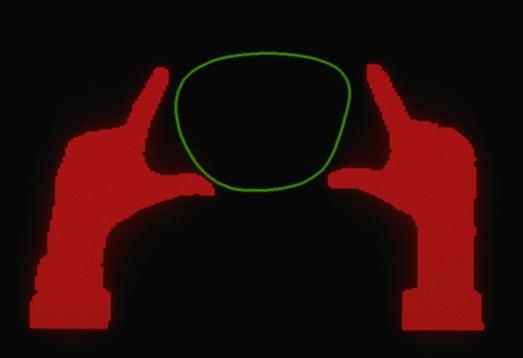
Myron’s work had a staggeringly rich repertoire of gestures, muti-finger, multi-hand and multi-person interaction.
|
|
1984: Multi-Touch Screen (Bob Boie, Bell Labs, Murray Hill NJ)
- A multi-touch touch screen, not tablet.
- The first muti-touch screen that I am aware of.
- Used a transparent capacitive array of touch sensors overlaid on a CRT. Could manipulate graphical objects with fingers with excellent response time
- Developed by Bob Boie, but was shown to me by Lloyd Nakatani (see above), who invited me to visit Bell Labs to see it after he saw the presentation of our work at SIGCHI in 1985
- Since Boie's technology was transparent and faster than ours, when I saw it, my view was that they were ahead of us, so we stopped working on hardware (expecting that we would get access to theirs), and focus on the software and the interaction side, which was our strength. Our assumption (false, as it turned out) was that the Boie technology would become available to us in the near future.
- Around 1990 I took a group from Xerox to see this technology it since I felt that it would be appropriate for the user interface of our large document processors. This did not work out.
- There was other multi-touch work at Bell Labs around the time of Boie's. See the 1984 work by Leonard Kasday, ( US Patent 4484179), which used optical techniques
|
|
|
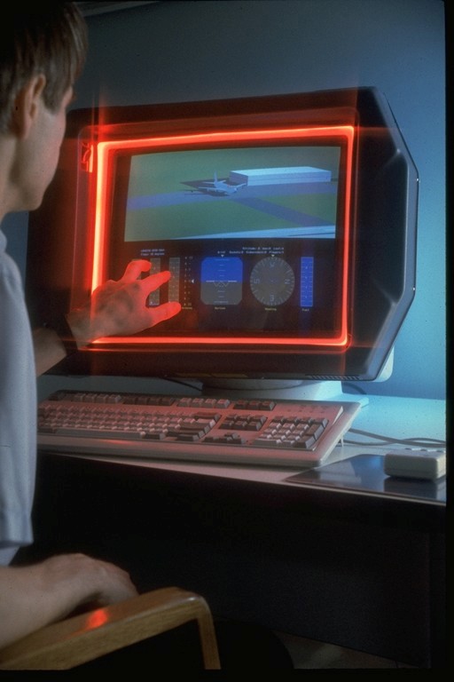
1985: Sensor Frame (Carnegie Mellon University)
-
This is work done by Paul McAvinney and described in the following paper from 1986r:
McAvinney, P. (1986). The Sensor Frame - A Gesture-Based Device for the Manipulation of Graphic Objects. Carnegie-Mellon University,
-
The device used optical sensors in the corners of the frame to detect fingers.
-
At the time that this was done, miniature cameras were essentially unavailable. Hence, the device used DRAM IC's with glass (as opposed to opaque) covers for imaging.
-
It could sense up to three fingers at a time fairly reliably (but due to optical technique used, there was potential for misreadings due to shadows.
-
In a later prototype variation built with NASA funding, the Sensor Cube, the device could also could detect the angle that the finger came in to the screen. (See: http://ntrs.nasa.gov/archive/nasa/casi.ntrs.nasa.gov/19940003261_1994003261.pdf).
|
 |
|
1986: Bi-Manual Input (University of Toronto)
-
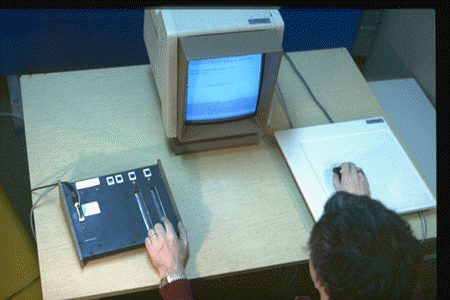
In 1985 we did a study, published the following year, which examined the benefits of two different compound bi-manual tasks that involved continuous control with each hand
-
The first was a positioning/scaling task. That is, one had to move a shape to a particular location on the screen with one hand, while adjusting its size to match a particular target with the other.
-
The second was a selection/navigation task. That is, one had to navigate to a particular location in a document that was currently off-screen, with one hand, then select it with the other.
-
Since bi-manual continuous control was still not easy to do (the ADB had not yet been released - see below), we emulated the Macintosh with another computer, a PERQ.
-
The results demonstrated that such continuous bi-manual control was both easy for users, and resulted in significant improvements in performance and learning.
-
See Buxton, W. & Myers, B. (1986). A study in two-handed input. Proceedings of CHI '86, 321-326.[video]
-
Despite this capability being technologically and economically viable since 1986 (with the advent of the ADB - see below - and later USB), there are still no mainstream systems that take advantage of this basic capability. Too bad.
-
This is an example of techniques developed for multi-device and multi-hand that can easily transfer to multi-touch devices.
|
 |
|
1986: Apple Desktop Bus (ADB) and the Trackball Scroller Init (Apple Computer / University of Toronto)
-
The Macintosh II and Macintosh SE were released with the Apple Desktop Bus. This can be thought of as an early version of the USB.
-
It supported plug-and-play, and also enabled multiple input devices (keyboards, trackballs, joysticks, mice, etc.) to be plugged into the same computer simultaneously.
-
The only downside was that if you plugged in two pointing devices, by default, the software did not distinguish them. They both did the same thing, and if a mouse and a trackball were operate at the same time (which they could be) a kind of tug-of-war resulted for the tracking symbol on the screen.
-
My group at the University of Toronto wanted to take advantage of this multi-device capability and contacted friends at Apple's Advanced Technology Group for help.
-
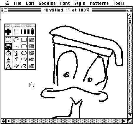
Due to the efforts of Gina Venolia and Michael Chen , they produced a simple "init" that could be dropped into the systems folder called the trackballscroller init.
-
It enabled the mouse, for example, to be designated the pointing device, and a trackball, for example, to control scrolling independently in X and Y. See, for example, Buxton, W. (1990). The Natural Language of Interaction: A Perspective on Non-Verbal Dialogues.In Laurel, B. (Ed.). The Art of Human-Computer Interface Design, Reading, MA: Addison-Wesley. 405-416.
-
They also provided another init that enabled us to grab the signals from the second device and use it to control a range of other functions. See fr example, Kabbash, P., Buxton, W.& Sellen, A. (1994). Two-Handed Input in a Compound Task. Proceedings of CHI '94, 417-423.
-
In short, with this technology, we were able to deliver the benefits demonstrated by Buxton & Myers (see above) on standard hardware, without changes to the operating system, and largely, with out changes even to the applications.
-
This is the closest that we came, without actually getting there, of supporting multi-point input - such as all of the two-point stretching, etc. that is getting so much attention now, 20 years later. It was technologically and economically viable then.
-
To our disappointment, Apple never took advantage of this - one of their most interesting - innovations.
|
 |
|
1991: Bidirectional Displays (Bill Buxton & Colleagues , Xerox PARC)
· First discussions about the feasibility of making an LCD display that was also an input device, i.e., where pixels were input as well as output devices. Led to two initiatives. (Think of the paper-cup and string “walkie-talkies” that we all made as kids: the cups were bidirectional and functioned simultaneously as both a speaker and a microphone.)
· Took the high res 2D a-Si scanner technology used in our scanners and adding layers to make them displays. The bi-directional motivation got lost in the process, but the result was the dpix display (http://www.dpix.com/about.html);
· The Liveboard project. The rear projection Liveboard was initially conceived as a quick prototype of a large flat panel version that used a tiled array of bi-directional dpix displays.
|
|
|
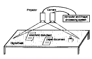
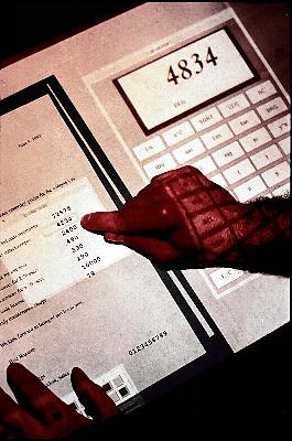
1991: Digital Desk (Pierre Wellner, Rank Xerox EuroPARC, Cambridge)
- A classic paper in the literature on augmented reality.
- Wellner, P. (1991). The Digital Desk Calculator: Tactile manipulation on a desktop display. Proceedings of the Fourth Annual Symposium on User Interface Software and Technology (UIST '91), 27-33.
- An early front projection tablet top system that used optical and acoustic techniques to sense both hands/fingers as well as certain objects, in particular, paper-based controls and data.
- Clearly demonstrated multi-touch concepts such as two finger scaling and translation of graphical objects, using either a pinching gesture or a finger from each hand, among other things.
- For example, see segment starting at 6:30 in the following 1991 video demo: http://video.google.com/videoplay?docid=5772530828816089246
|
|
|
1992: Simon (IBM & Bell South)
· IBM and Bell South release what was arguably the world's first smart phone, the Simon.
· What is of historical interest is that the Simon, like the iPhone, relied on a touch-screen driven “soft machine” user interface.
· While only a single-touch device, the Simon foreshadows a number of aspects of what we are seeing in some of the touch-driven mobile devices that we see today.
· Sidebar: my working Simon is one of the most prized pieces in my collection of input devices.
|

|
|
1992: Wacom (Japan)
-
In 1992 Wacom introduced their UD series of digitizing tablets. These were special in that they had mutli-device / multi-point sensing capability. They could sense the position of the stylus and tip pressure, as well as simultaneously sense the position of a mouse-like puck. This enabled bimanual input.
-
Working with Wacom, my lab at the University of Toronto developed a number of ways to exploit this technology to far beyond just the stylus and puck. See the work on Graspable/Tangible interfaces, below.
-
Their next two generations of tablets, the Intuos 1 (1998) and Intuos 2 (2001) series extended the multi-point capability. It enabled the sensing of the location of the stylus in x and y, plus tilt in x and tilt in y (making the stylus a location-sensitive joystick, in effect), tip pressure, and value from a side-mounted dial on their airbrush stylus. As well, one could simultaneously sense the position and rotation of the puck, as well as the rotation of a wheel on its side. In total, one was able to have control of 10 degrees of freedom using two hands.
-
While this may seem extravagant and hard to control, that all depended on how it was used. For example, all of these signals, coupled with bimanual input, are needed to implement any digital airbrush worthy of the name. With these technologies we were able to do just that with my group at Alias|Wavefront, again, with the cooperation of Wacom.
-
See also: Leganchuk, A., Zhai, S.& Buxton, W. (1998).Manual and Cognitive Benefits of Two-Handed Input: An Experimental Study.Transactions on Human-Computer Interaction, 5(4), 326-359.
|

|
|
1992: Starfire (Bruce Tognazinni , SUN Microsystems)
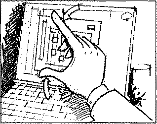
· Bruce Tognazinni produced an future envisionment film, Starfire, that included a number of multi-hand, multi-finger interactions, including pinching, etc.
|
|
|
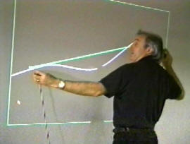
1994-2002: Bimanual Research (Alias|Wavefront Toronto)
· Developed a number of innovative techniques for multi-point / multi-handed input for rich manipulation of graphics and other visually represented objects. Only some are mentioned specifically on this page.
· There are a number of videos can be seen which illustrate these techniques, along with others: http://www.billbuxton.com/buxtonAliasVideos.html
· Also see papers on two-handed input to see examples of multi-point manipulation of objects at: http://www.billbuxton.com/papers.html#anchor1442822
|
|
|
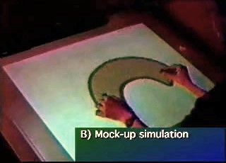
1995: Graspable/Tangible Interfaces (Input Research Group, University of Toronto)
· Demonstrated concept and later implementation of sensing the identity, location and even rotation of multiple physical devices on a digital desk-top display and using them to control graphical objects.
· By means of the resulting article and associated thesis introduced the notion of what has come to be known as “graspable” or “tangible” computing.
· Fitzmaurice, G.W., Ishii, H. & Buxton, W. (1995). Bricks: Laying the foundations for graspable user interfaces. Proceedings of the ACMSIGCHI Conference on Human Factors in Computing Systems (CHI'95), 442–449.
|
 |
|
1995: DSI Datotech (Vancouver BC)
· In 1995 this company made a touch tablet, the HandGear, capable of multipoint sensing. They also developed a software package, Gesture Recognition Technology (GRT), for recognizing hand gestures captured with the tablet.
· The company went out of business around 2002
|
|
|
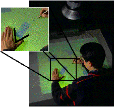
1995/97: Active Desk (Input Research Group / Ontario Telepresence Project, University of Toronto)
- Around 1992 we made a drafting table size desk that had a rear-projection data display, where the rear projection screen/table top was a translucent stylus controlled digital graphics tablet (Scriptel). The stylus was operated with the dominant hand. Prior to 1995 we mounted a camera bove the table top. It tracked the position of the non-dominant hand on the tablet surface, as well as the pose (open angle) between the thumb and index finger. The non-dominant hand could grasp and manipulate objects based on what it was over and opening and closing the grip on the virtual object. This vision work was done by a student, Yuyan Liu.
- Buxton, W. (1997). Living in Augmented Reality: Ubiquitous Media and Reactive Environments. In K. Finn, A. Sellen & S. Wilber (Eds.). Video Mediated Communication. Hillsdale, N.J.: Erlbaum, 363-384. An earlier version of this chapter also appears in Proceedings of Imagina '95, 215-229.
|
Simultaneous bimanual and multi-finger interaction on large interactive display surface
|
|
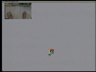
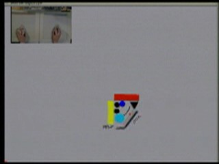
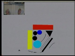
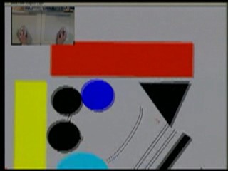
1997: T3 (Alias|Wavefront, Toronto)
- T3 was a bimanual tablet-based system that utilized a number of techniques that work equally well on multi-touch devices, and have been used thus.
- These include, but are not restricted to grabbing the drawing surface itself from two points and scaling its size (i.e., zooming in/out) by moving the hands apart or towards each other (respectively). Likewise the same could be done with individual graphical objects that lay on the background. (Note, this was simply a multi-point implementation of a concept seen in Ivan Sutherland’s Sketchpad system.)
- Likewise, one could grab the background or an object and rotate it using two points, thereby controlling both the pivot point and degree of the rotation simultaneously. Ditto for translating (moving) the object or page.
- Of interest is that one could combine these primitives, such as translate and scale, simultaneously (ideas foreshadowed by Fitzmaurice’s graspable interface work – above).
- Kurtenbach, G., Fitzmaurice, G., Baudel, T. & Buxton, W. (1997). The design and evaluation of a GUI paradigm based on tabets, two-hands, and transparency. Proceedings of the 1997 ACM Conference on Human Factors in Computing Systems, CHI '97, 35-42. [video].
|
  |
|
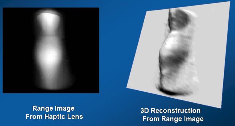
1997: The Haptic Lens (Mike Sinclair, Georgia Tech / Microsoft Research)
- The Haptic Lens, a multi-touch sensor that had the feel of clay, in that it deformed the harder you pushed, and resumed it basic form when released. A novel and very interesting approach to this class of device.
- Sinclair, Mike (1997). The Haptic Lens. ACM SIGGRAPH 97 Visual Proceedings: The art and interdisciplinary programs of SIGGRAPH '97, Page: 179
|
 |
|
|
~1998: Fingerworks (Newark, Delaware).
- Made a range of touch tablets with multi-touch sensing capabilities, including the iGesture Pad. They supported a fairly rich library of multi-point / multi-finger gestures.
- Founded by two University of Delaware academics, John Elias and Wayne Westerman
- Product largely based on Westerman’s thesis: Westerman, Wayne (1999). Hand Tracking,Finger Identification, and Chordic Manipulation on a Multi-Touch Surface. U of Delaware PhD Dissertation: http://www.ee.udel.edu/~westerma/main.pdf
- Note that Westerman's work was solidly built on the above work. His thesis cites Matha's 1982 work which introduced multi-touch, as well as Krueger's work, which introduced - among other things - the pinch gesture. Of the 172 publications cited, 34 (20%) are authored or co-authored by me an/or my students.
- The company was acquired in early 2005 by Apple Computer.
- Elias and Westerman moved to Apple.
- Fingerworks ceased operations as an independent company.
- However, it left a lot of fans, and documentation, including tutorials and manuals are still downloadable from: http://www.fingerworks.com/downloads.html
|
 |
|
|
1999: Portfolio Wall (Alias|Wavefront, Toronto On, Canada)
- A product that was a digital cork-board on which images could be presented as a group or individually. Allowed images to be sorted, annotated, and presented in sequence.
- Due to available sensor technology, did not us multi-touch; however, its interface was entirely based on finger touch gestures that went well beyond what typical touch screen interfaces were doing at the time, and which are only now starting to appear on some touch-based mobile devices.
- For example, to advance to the next slide in a sequence, one flicked to the right. To go back to the previous image, one flicked left.
- The gestures were much richer than just left-right flicks. One could instigate different behaviours, depending on which direction you moved your finger.
- In this system, there were eight options, corresponding to the 8 main points of the compass. For example, a downward gesture over a video meant "stop". A gesture up to the right enabled annotation. Down to the right launched the application associated with the image. etc.
- They were self-revealing, could be done eyes free, and leveraged previous work on “marking menus.”
- See a number of demos at: http://www.billbuxton.com/buxtonAliasVideos.html
|
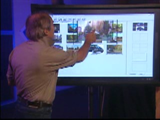 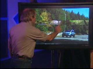
Touch to open/close image Flick right = next / Flick left = previous
Portfolio Wall (1999)
|
|
2002: Andrew Fentem (UK) http://www.andrewfentem.com/
- States that he has been working on multi-touch for music and general applications since 2002
- However, appears not to have published any technical information or details on this work in the technical or scientific literature.
- Hence, the work from this period is not generally known, and - given the absence of publications - has not been cited.
- Therefore it has had little impact on the larger evolution of the field.
- This is one example where I am citing work that I have not known and loved for the simple reason that it took place below the radar of normal scientific and technical exchange.
- I am sure that there are several similar instances of this. Hence I include this as an example representing the general case.
|

|
|
2003: University of Toronto (Toronto)
· paper outlining a number of techniques for multi-finger, multi-hand, and multi-user on a single interactive touch display surface.
· Many simpler and previously used techniques are omitted since they were known and obvious.
· Mike Wu, Mike & Balakrishnan, Ravin (2003). Multi-Finger and Whole Hand Gestural Interaction Techniques for Multi-User Tabletop Displays. CHI Letters
|
|

|
Freeform rotation. (a) Two fingers are used to rotate an object. (b) Though the pivot finger is lifted, the second finger can continue the rotation.
|
|

|
This parameter adjustment widget allows two-fingered manipulation.
|
|
|
2003: Jazz Mutant (Bordeaux France) http://www.jazzmutant.com/
· Make one of the first transparent multi-touch, one that became - to the best of my knowledge – the first to be offered in a commercial product.
· The product for which the technology was used was the Lemur, a music controller with a true multi-touch screen interface.
· An early version of the Lemur was first shown in public in LA in August of 2004.
|

|
|
2004: TouchLight (Andy Wilson, Microsoft Research): http://research.microsoft.com/~awilson/
· TouchLight (2004). A touch screen display system employing a rear projection display and digital image processing that transforms an otherwise normal sheet of acrylic plastic into a high bandwidth input/output surface suitable for gesture-based interaction. Video demonstration on website.
· Capable of sensing multiple fingers and hands, of one or more users.
· Since the acrylic sheet is transparent, the cameras behind have the potential to be used to scan and display paper documents that are held up against the screen .
|
|
|
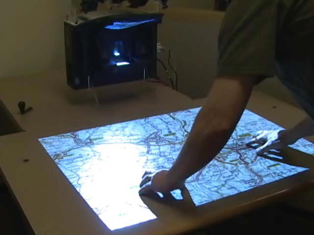
2005: PlayAnywhere (Andy Wilson, Microsoft Research): http://research.microsoft.com/~awilson/
· PlayAnywhere (2005). Video on website
· Contribution: sensing and identifying of objects as well as touch.
· A front-projected computer vision-based interactive table system.
· Addresses installation, calibration, and portability issues that are typical of most vision-based table systems.
· Uses an improved shadow-based touch detection algorithm for sensing both fingers and hands, as well as objects.
· Object can be identified and tracked using a fast, simple visual bar code scheme. Hence, in addition to manual mult-touch, the desk supports interaction using various physical objects, thereby also supporting graspable/tangible style interfaces.
· It can also sense particular objects, such as a piece of paper or a mobile phone, and deliver appropriate and desired functionality depending on which..
|
|
|
2005: Tactiva (Palo Alto) http://www.tactiva.com/
· Have announced and shown video demos of a product called the TactaPad.
· It uses optics to capture hand shadows and superimpose on computer screen, providing a kind of immersive experience, that echoes back to Krueger (see above)
· Is multi-hand and multi-touch
· Is tactile touch tablet, i.e., the tablet surface feels different depending on what virtual object/control you are touching
|
 
|
|
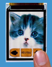
2005: Toshiba Matsusita Display Technology (Tokyo)
· Announce and demonstrate LCD display with “Finger Shadow Sensing Input” capability
· One of the first examples of what I referred to above in the 1991 Xerox PARC discussions. It will not be the last.
· The significance is that there is no separate touch sensing transducer. Just as there are RGB pixels that can produce light at any location on the screen, so can pixels detect shadows at any location on the screen, thereby enabling multi-touch in a way that is hard for any separate touch technology to match in performance or, eventually, in price.
· http://www3.toshiba.co.jp/tm_dsp/press/2005/05-09-29.htm
|
|
|
2006: Benko & collaborators (Columbia University & Microsoft Research)
· Some techniques for precise pointing and selection on muti-touch screens
· Benko, H., Wilson, A. D., and Baudisch, P. (2006). Precise Selection Techniques for Multi-Touch Screens. Proc. ACM CHI 2006 (CHI'06: Human Factors in Computing Systems, 1263–1272
· video
|

|
|
2006: Plastic Logic (Cambridge UK)
- A flexible e-ink display mounted over a multi-point touch pad, thereby creating an interactive multi-touch display.
- Demonstrated in public at the Trade Show of the 2006 SID conference, San Francisco.
|
|
|
2006: Synaptics & Pilotfish (San Jose) http://www.synaptics.com
· Jointly developed Onyx, a soft multi-touch mobile phone concept using transparent Synaptics touch sensor. Can sense difference of size of contact. Hence, the difference between finger (small) and cheek (large), so you can answer the phone just by holding to cheek, for example.
· http://www.synaptics.com/onyx/
|

|
|
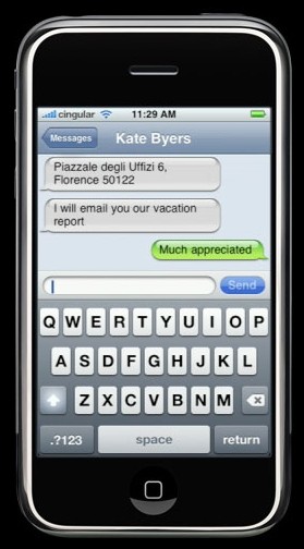
2007: Apple iPhone http://www.apple.com/iphone/technology/
- Like the 1992 Simon (see above), a mobile phone with a soft touch-based interface.
- Outstanding industrial design and very smooth interaction.
- Employed multi-touch capability to a limited degree
- Uses it, for example, to support the "pinching" technique introduced by Krueger, i.e., using the thumb and index finger of one hand to zoom in or out of a map or photo.
- Works especially well with web pages in the browser
- Uses Alias Portfolio Wall type gestures to flick forward and backward through a sequence of images.
- Did not initially enable use of multi-touch to hold shift key with one finger in order to type an upper case character with another with the soft virtual keyboard. This did not get implemented until about a year after its release.
|
 |
|
|
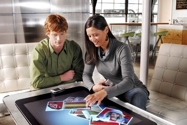
2007: Microsoft Surface Computing http://www.surface.com
- Interactive table surface
- Capable of sensing multiple fingers and hands
- Capable of identifying various objects and their position on the surface
- Commercial manifestation of internal research begun in 2001 by Andy Wilson (see above) and Steve Bathiche
- A key indication of this technology making the transition from research, development and demo to mainstream commercial applications.
|
|
|
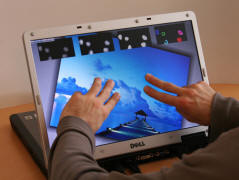
2007: ThinSight, Microsoft Research Cambridge (UK) http://www.billbuxton.com/UISTthinSight.pdf
- Thin profile multi-touch technology that can be used with LCD displays.
- Hence, can be accommodated by laptops, for example
- Optical technology, therefore capable of sensing both fingers and objects
- Therefore, can accommodate both touch and tangible styles of interaction
|
|
|
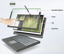
2008: N-trig http://www.n-trig.com/
- Commercially multi-touch sensor
- Can sense finger and stylus simultaneously
- unlike most touch sensors that support a stylus, this incorporates specialized stylus sensor
- result is much higher quality digital ink from stylus
- Incorporated into some recent Tablet-PCs
- Technology scales to larger formats, such as table-top size
|
|